Design Guidelines
Our icons are designed to be clean and modern icons. These guidelines show how icons are supposed to be designed for the ProIcons icon library.
Designing icons
Canvas
Each icon is designed on a 24px * 24px grid with a 2px padding, providing a 20px * 20px active area.
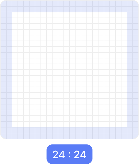
Note
Icons shouldn't be larger than 20px * 20px. Some icons exceed this size, but this is rarely done. We will review icons that may need this.
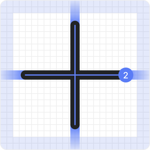
Stroke
We use a 1.5px stroke for all of our icons. All strokes are centered with round line caps and joins.
Shape
Size
Shapes can be up to 18.5px * 18.5px in size, converting to 20px * 20px (total active area) when outlined.
| Stroked | Outlined |
|---|---|
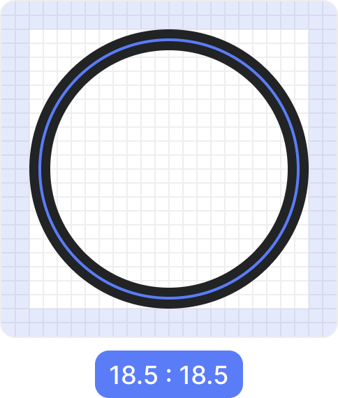 |  |
Important
Please do not outline the strokes of your icon. This is shown for informational reasons only.
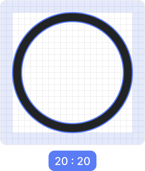
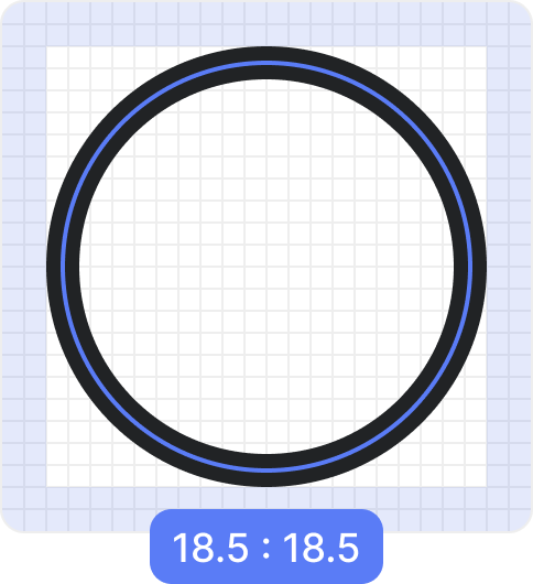
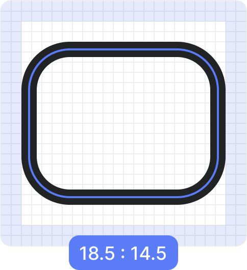
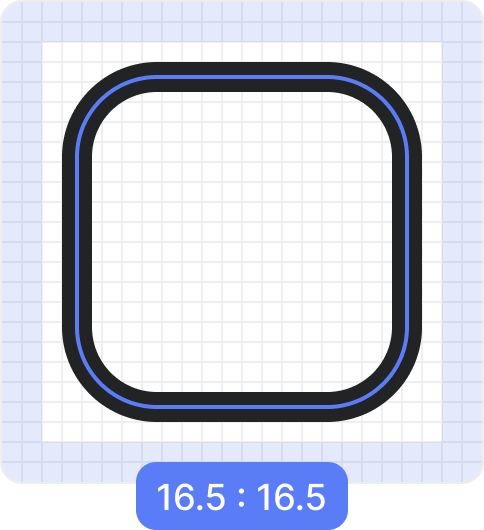
Optical volume
In order to keep shapes balanced, squares should be 2px smaller than circles in size. Circles and other non-square shapes should go up to 18.5px in either width or height.
| Circle | Rectangle | Square |
|---|---|---|
 |  |  |
Corner radius
Corner radius is one of the key factors in ProIcons. Theses should be used carefully and when needed.
Larger shapes can use larger corner radius, between 2px and 4px.
Smaller shapes and acute angles can use smaller corner radius, up to 2px.
Even smaller shapes and lines may use a 0.6px corner radius or no corner radius.
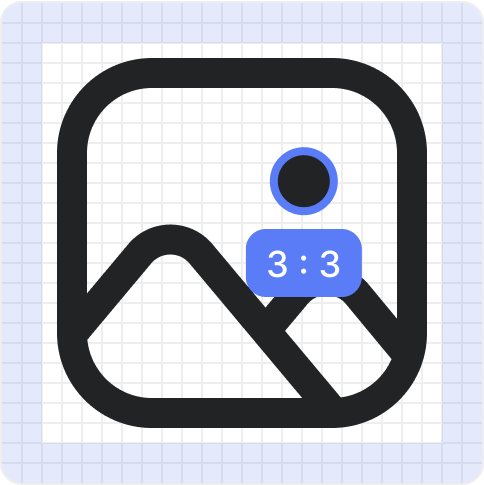
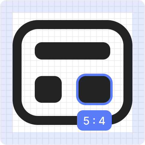
Filled shapes
Smaller shapes that would make the icon feel too dense if stroked can be filled. Icons may also have filled dots that are 2.5px * 2.5px in size.
| Photo | Cookie | Board |
|---|---|---|
 |  |  |
Naming
Before submitting your icons, please make sure to follow our naming conventions.
Submitting New Icons
When you have your icons designed, please follow our contributing guide on how to add your icon to the set and send in your pull request.